Forty Fixed Fonts for Programming
I reviewed Forty Fixed Fonts and rated how good they are for programming.
How They Were Rated
1. They had to be monospaced.
|
 |
2. They had to have good fundamentals:
Upper case O and zero have to be distinct
Upper case I, lower case L and the number 1 all have to be distinct
Punctuation has to be clear, not some afterthought
Brackets, square brackets, curly braces and angle brackets all have to be clear
Clear dots in full stop, comma, semicolon and colon
|
|
3. Nice to have:
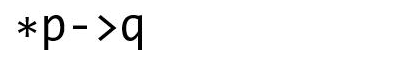
A mid aligned asterisk
A mid aligned hyphen, that lines up to make a pointer ->
Readily available and free
|
 |
Notes
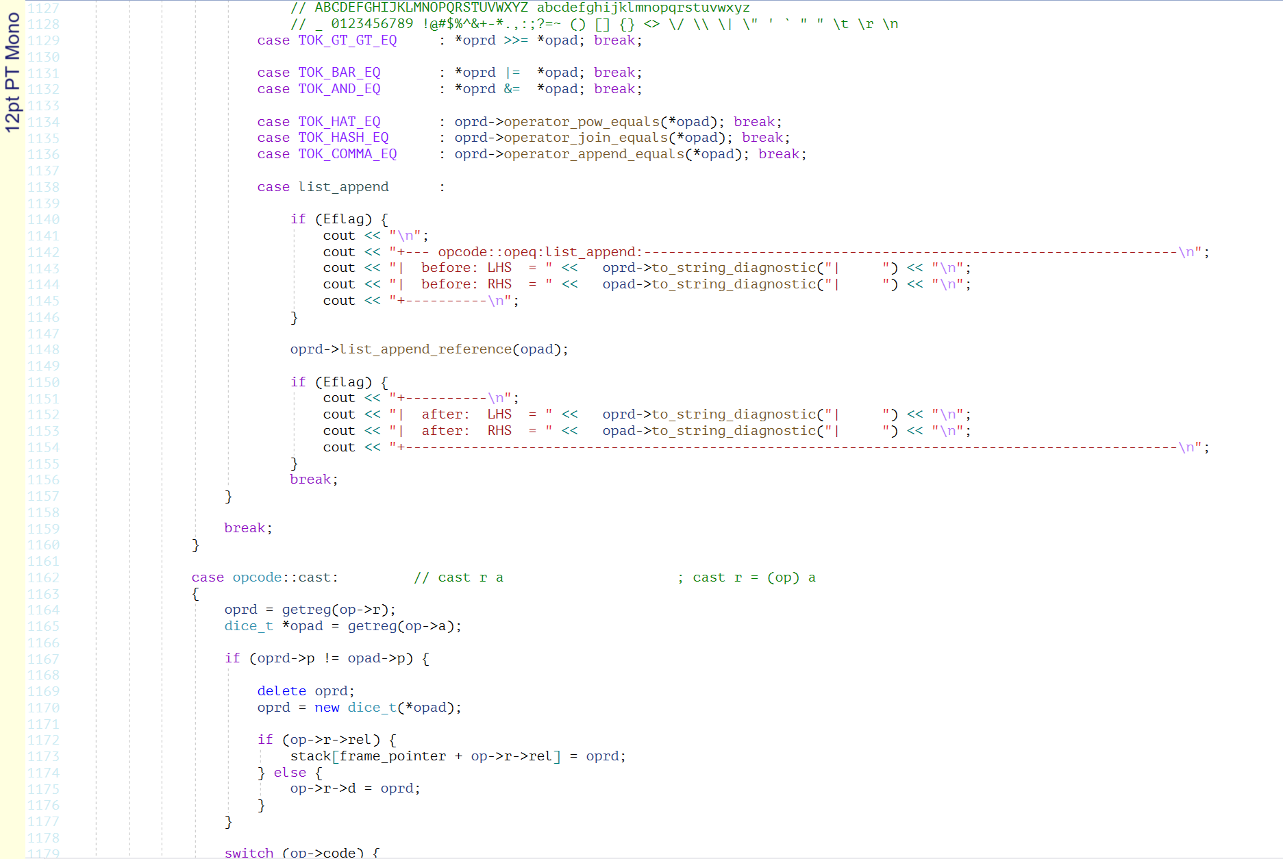
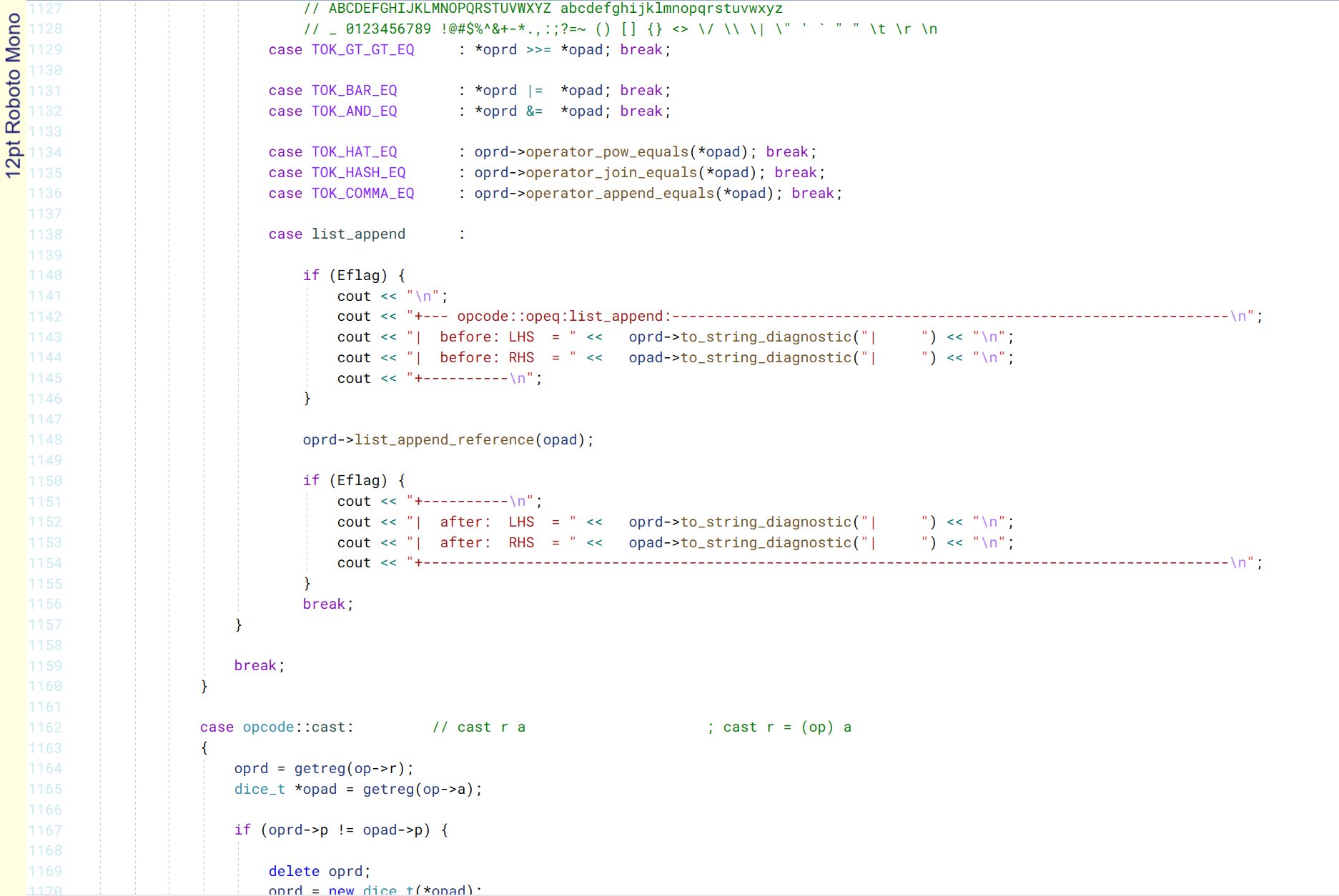
All fonts below have been screen captures in Visual Studio using a 12pt font
and zoomed to 125%. Because that is the way I work.
A few naturally smaller fonts have been scaled to 150% to match the others.
The font pictures here have been compressed to png files.
There may be some softening around the edges.
If you like the font, make sure to check it out for yourself.
Modern fonts have ligatures (special versions of a combination of characters)
specifically designed for computer languages.
When they get it right it can be amazing.
But with a combination of getting it wrong and poor support in editors, they are
usually just annoying.
Visual Studio currently can't do anything with ligatures.
You can't select the ligature set and you can't disable them.
You just have to take what the font gives you.
This is a real shame because there are some fine fonts that would be great if
it were not for ligatures
(eg
Apercu Mono and
Fira Code).
The font pictures in the tables link to my review of the font.
The pictures in the review link to a full page code sample.
The Best
Full List Alphabetically
Review
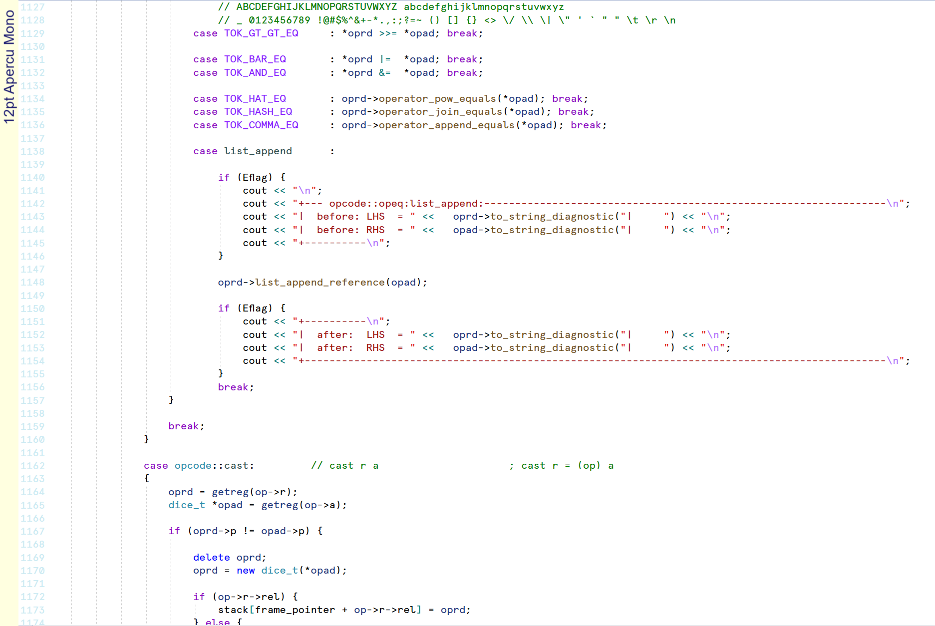
Apercu Mono
Good fundamentals, Apercu Mono is very clear with distinct characters and some style.
Apercu Mono has the most tricked out lower case L that looks like a ladel.
I am not a fan of the squiggly question mark. The backtick is a little weak.
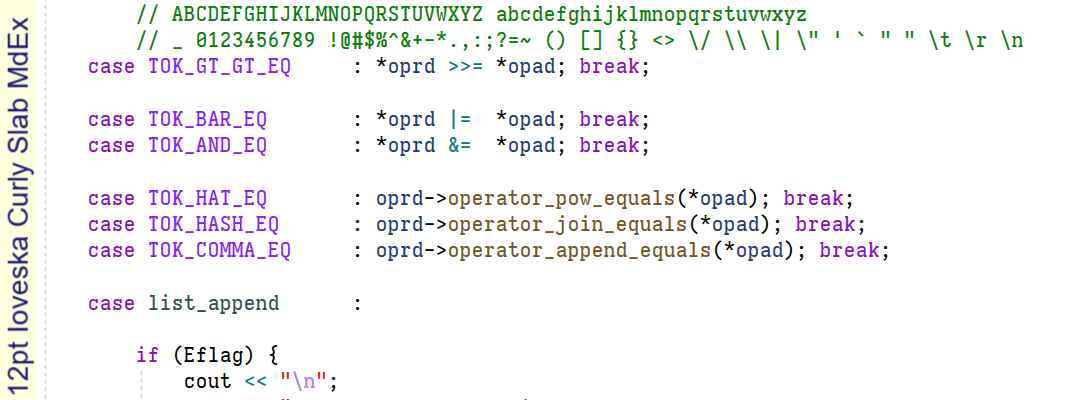
But I can't get disable ligatures in Visual Studio and this font seems stuck in
plain text ligatures instead of C++, so it has this horrible 'fl' ligature that is
one character (see Eflag in the above picture) and it is driving me crazy.
Hopefully Visual Studio will be able to disable ligatures in the future and this
font can see some use.
Ligature letdown in an otherwise great looking font: 5.5
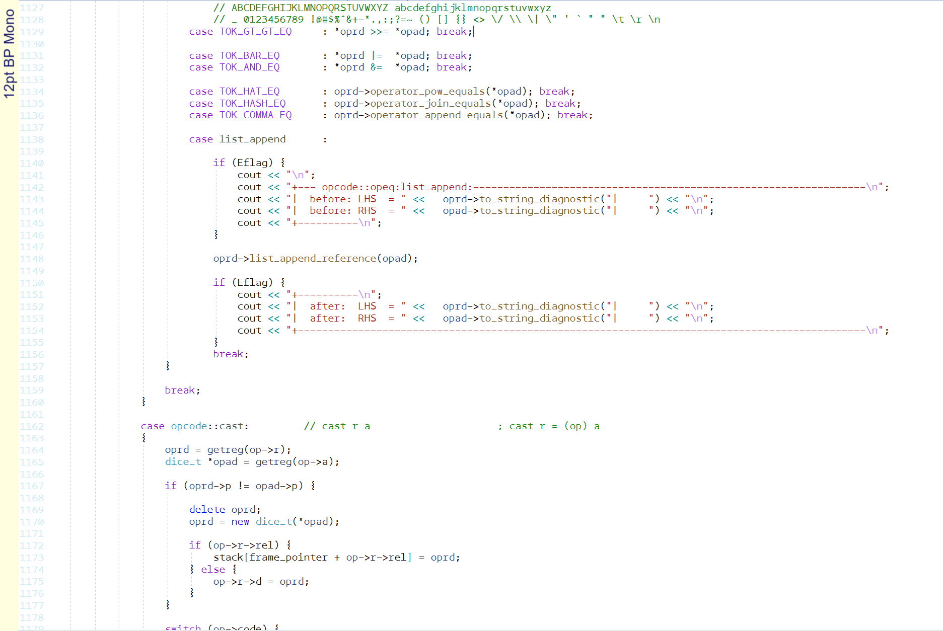
BP Mono
This courier looking font is quite legible, but I think it is thin and bit ugly.
Some awkward thickening moments on the lower curve of the 'S', the spine of the 's' and
a parts of the numbers.
Asterisk looks like a small dead insect.
Lowercase 'r' has so much top serif that it looks like it doesn't know if it is coming or going.
Meh. It's a 6.
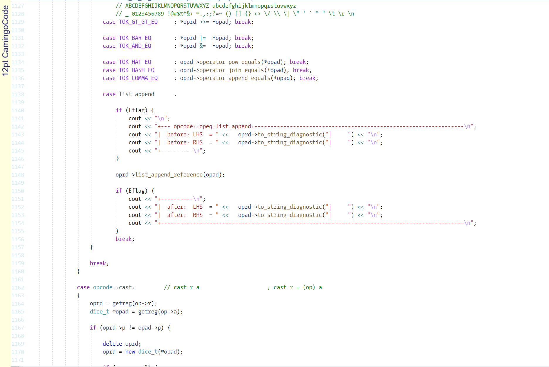
CamingoCode
CamingoCode looks like it is transitioning from a Courier style to a Consolas but is
not fully commited yet.
Good Fundamentals.
Could do with a bit more weight.
Lower case 'r' has more beak than an erect toucan.
Might do well on a dark background.
Nice, but too thin for me. It's a 7.
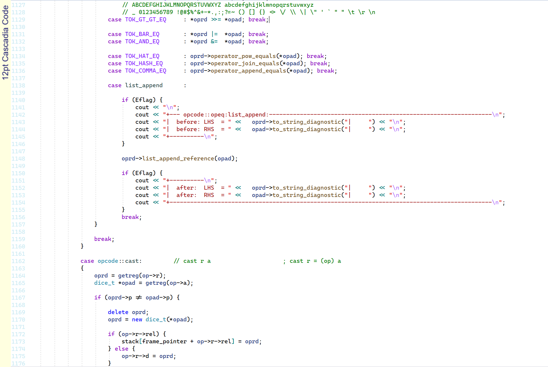
Cascadia Code
Nice font with good fundamentals and some stylish characters like 'K' and 'k'.
Low crossbar on the 'f' reminds me of the homeboys wearing their pants a bit too low.
Nice mid asterisk and long hypen for making horizonal lines.
Comma and Semicolon have no dot. Angled brackets are a little small.
Backslash touches slash. Weak backtick.
Overall pretty nice. It's an 8.
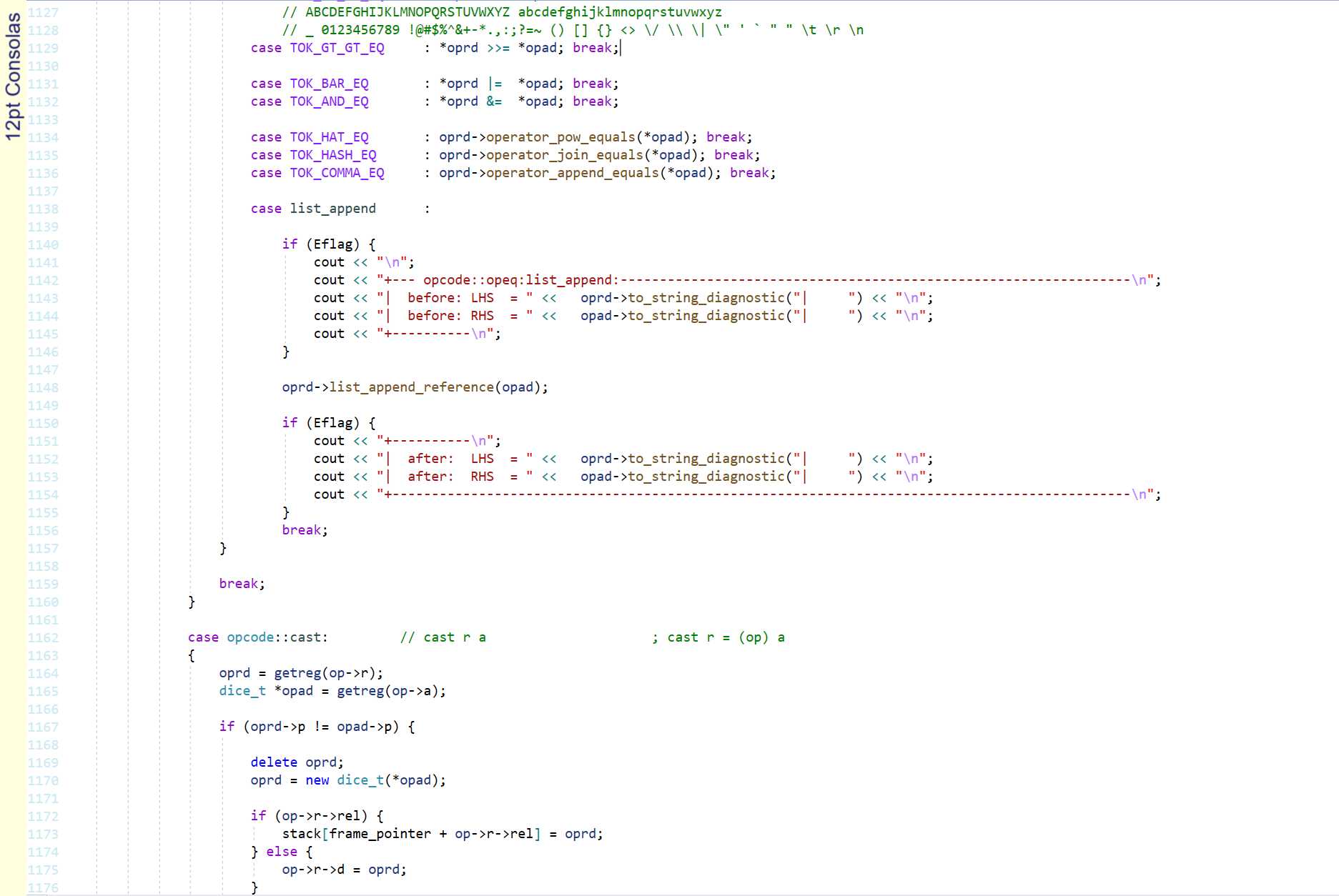
Consolas
Luc(as) de Groot's Consolas has been my font of choice even before it arrived as standard
in Windows Vista.
This font is nearly perfect.
Possibly the only thing you could say is that it doesn't have a mid asterisk,
the '@' is a bit thin and the backtick is slightly weak.
I would have preferred a tailed serif on the end of lower case L instead of a slab serif.
(compare
DejaVu Sans Mono below).
Nearly perfect: 9.5
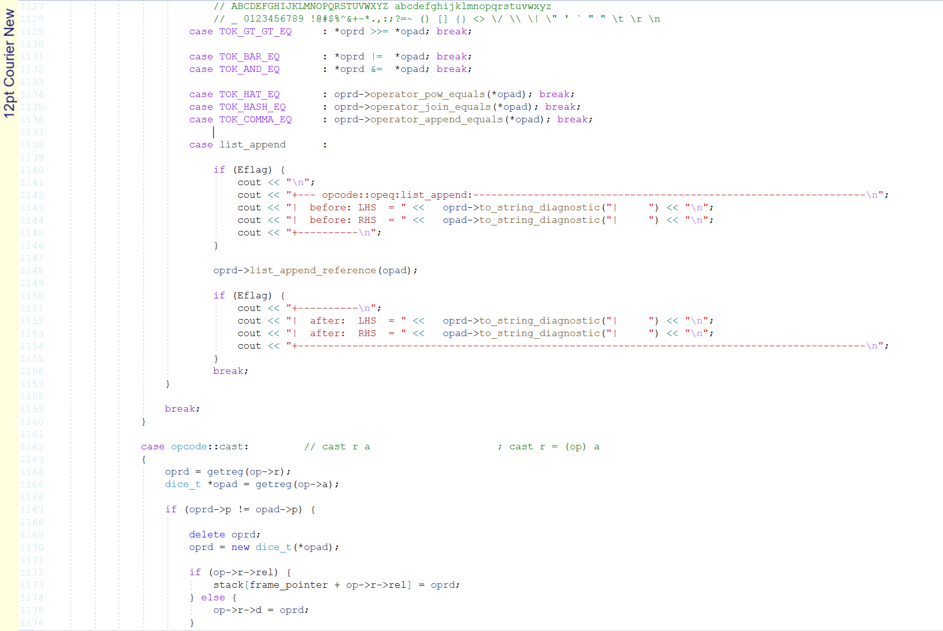
Courier New
Ugh. Put the typewriter away and burn it. It is like the Comic Sans of monospaced fonts.
Confusion between 'O' and '0' makes it totally unsuitable for coding.
Ugly irregular high asterisk. Pissweak thin braces.
Go away. It's a 2.
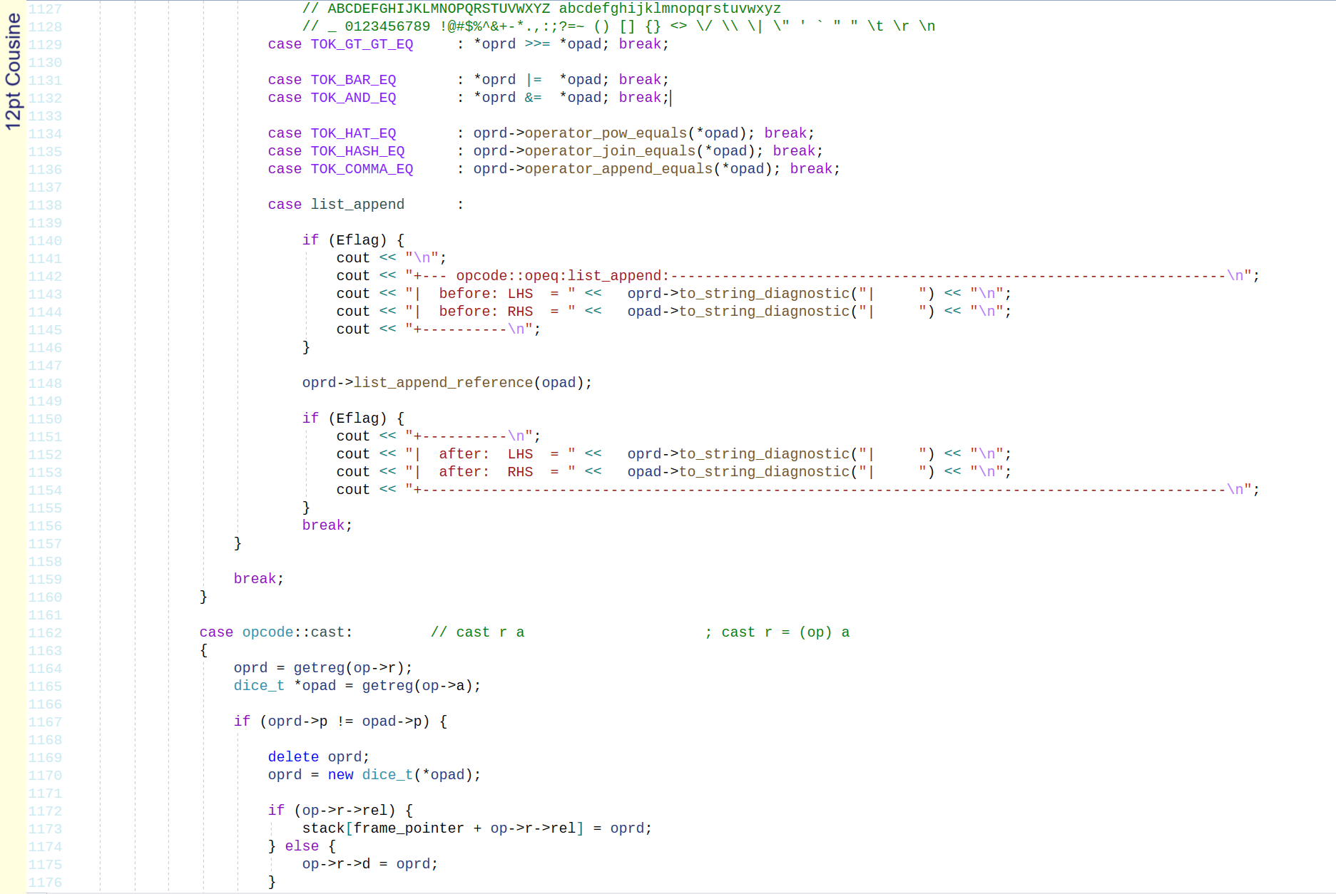
Cousine
A lot of the characters in Cousine are nice.
But a few bad apples really spoil this bunch.
The underscore is painfully thin. The tilde has no wiggle to it.
The backtick is weak and the hyphen is lower than chihuahuas balls.
Let down by a few bad apples: 4.5
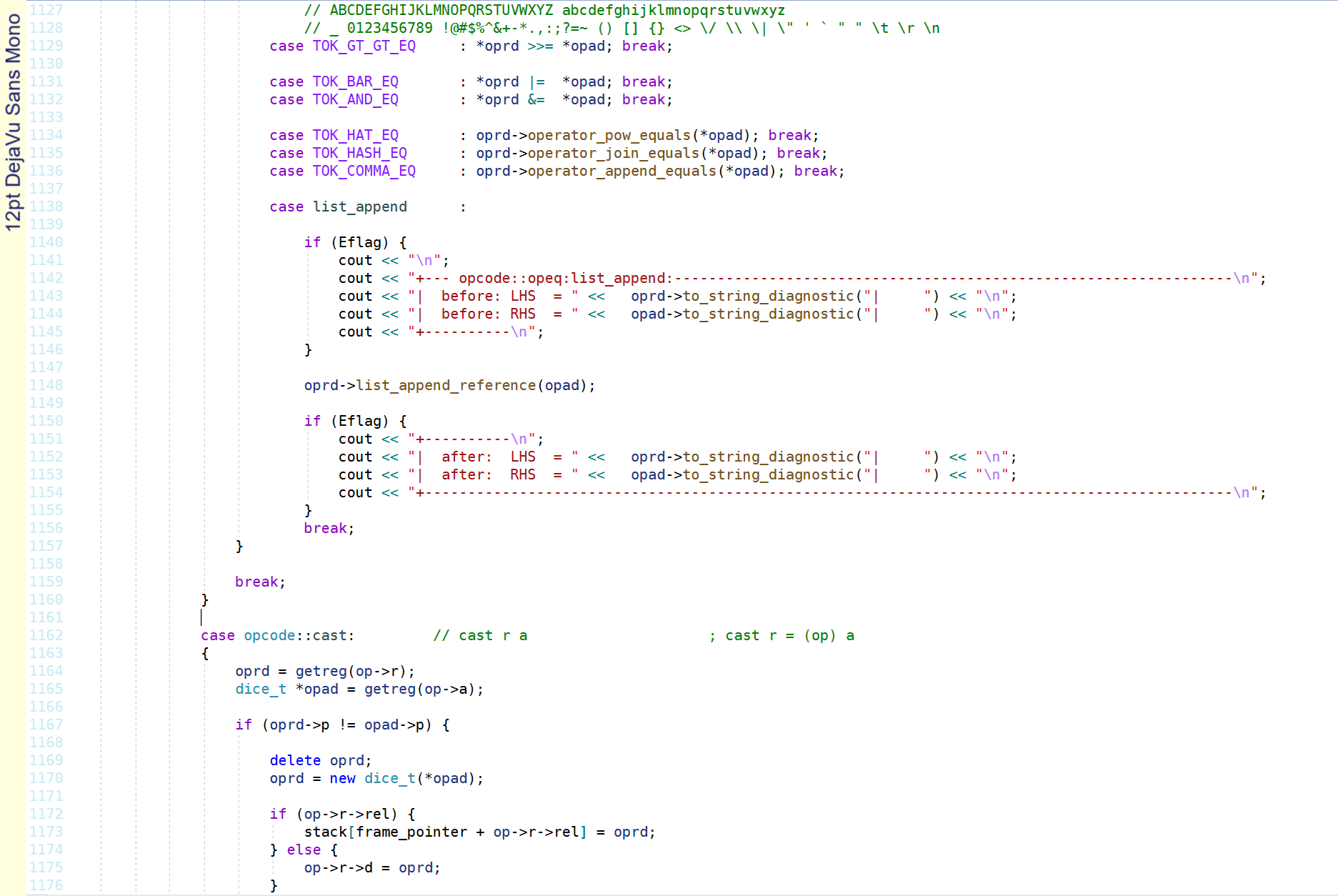
DejaVu Sans Mono
Didn't we see this font already? Isn't it
Consolas?
It is
very close to Consolas, but it has a few subtle differences.
The line spacing is exactly the same, but the letters are slightly taller.
The 'g' has no loop, the ampersand is open, the '@' and '*' are different.
The underscore is slightly bigger.
Possibly the only thing it does better than Consolas is the lowercase L
has a tailed serif.
Really good, but Consolas is better: 8
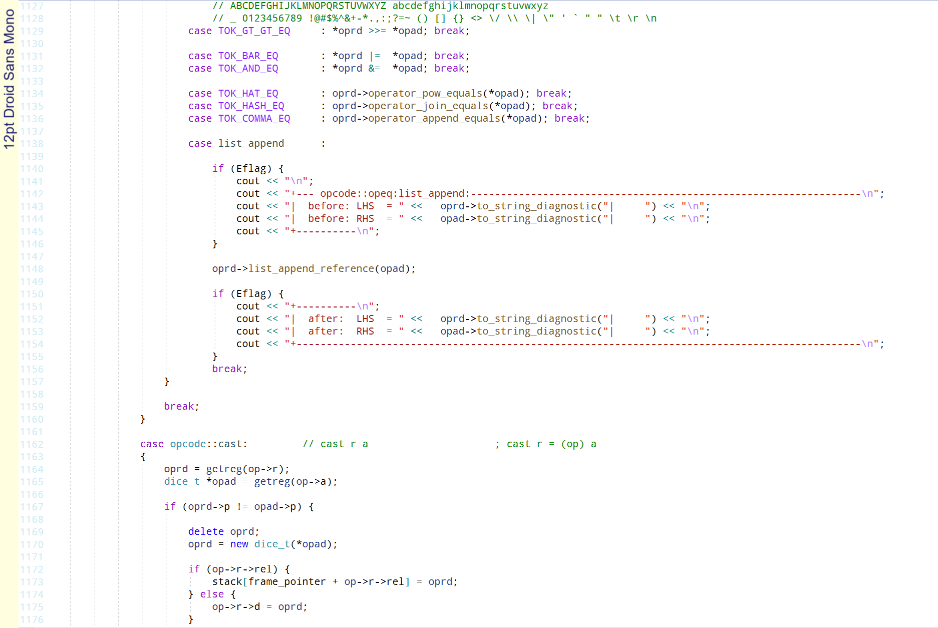
Droid Sans Mono
Looks good on the surface, but the capital O and zero '0' are similar, so it is an
instant fail. The lower case L and one are not great either.
More like a trendy font pretending to be a programming font than an actual
programming font.
Imitation: 4
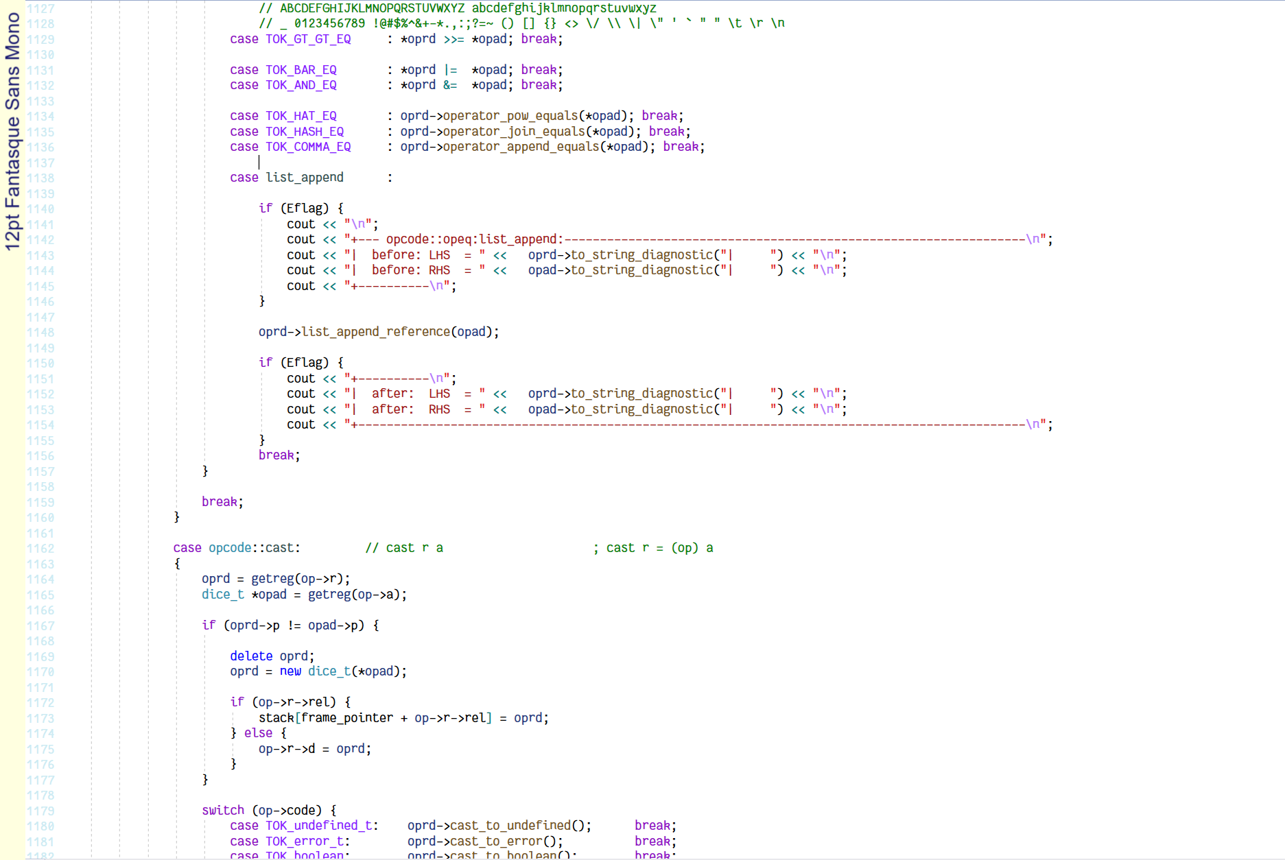
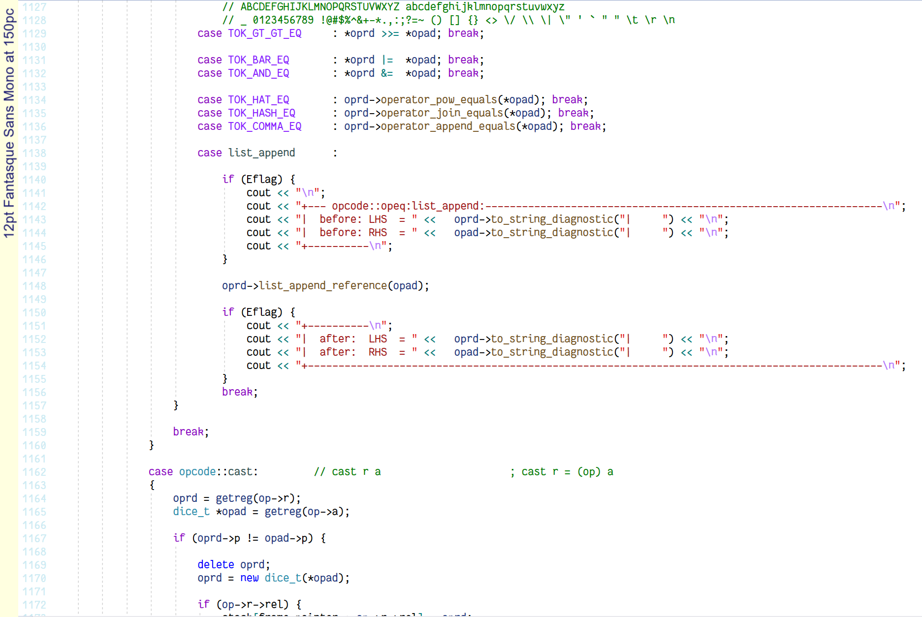
Fantasque Sans Mono at 125%
Fantasque Sans Mono at 150%
Who said programming fonts can't be stylish? Fantasque will split the programming
community on whether it is good or not.
On the one hand it is very solid programming font with good fundamentals.
On the other hand is it a bit comical with it's curvy looks and height variation.
The lowercase k is closed and for me that just doesn't quite fit in.
Lower case f has a choker for a crossbar.
Note that Fantasque is quite a small font and I am also including the 150% scaling to
match the size of other fonts on this page (that are at 125%).
I like it. It's an 8.5.
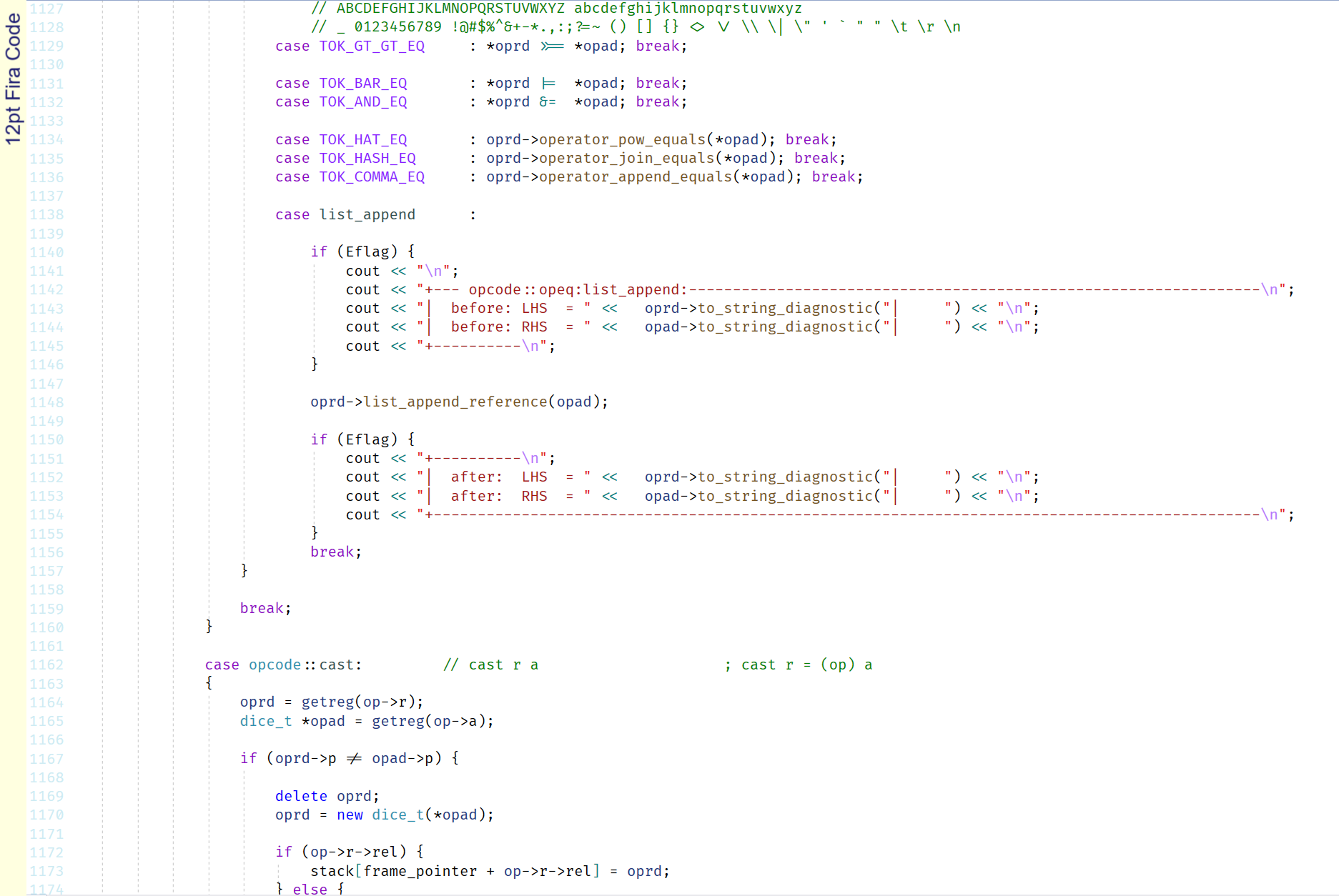
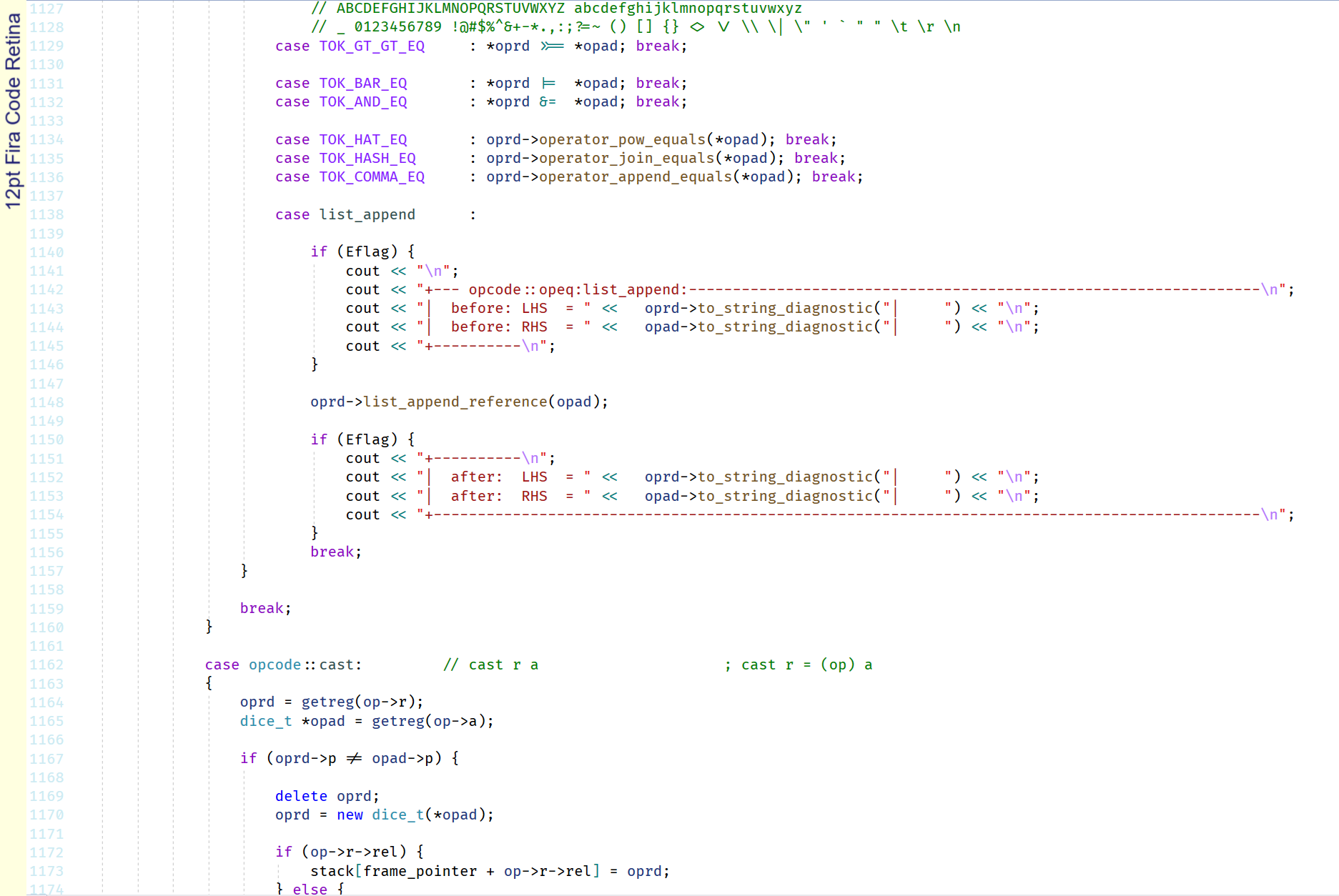
Fira Code
Fira Code Retina
Fira Code Medium
Strong fundamentals, but some weird ligatures.
There is a lot to like about this font, but the ligatures are not perfect for C++.
>>= looks all connected and weird. &= looks nice. Cat tail @ is nice.
Fanged lower case r is a bit weird. Sweeping descender on the lower case j is nice.
Good choice: 8.5
Hack
No nonsense font with strong fundamentals.
Plenty to like here.
I would have preferred a dotted zero instead of a slashed zero and maybe a mid
aligned asterisk. The braces are a bit wonky.
Good choice: 8.5
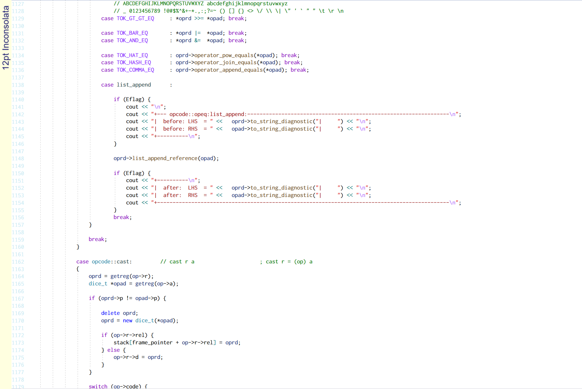
Inconsolata
Good fundamentals. Clear letters.
Weak apostrophe and backtick. Deep braces want to give you a hug. One and lower case
L are bit too similar.
Almost there: 7
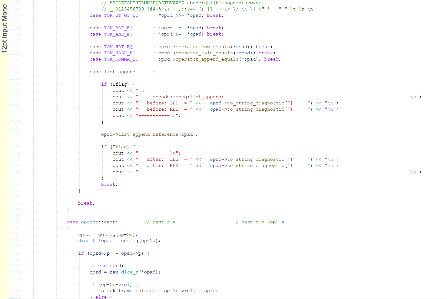
Input Mono
Apart from slightly bigger line spacing this is just
Courier New.
Even worse than
Courier New: 1.5
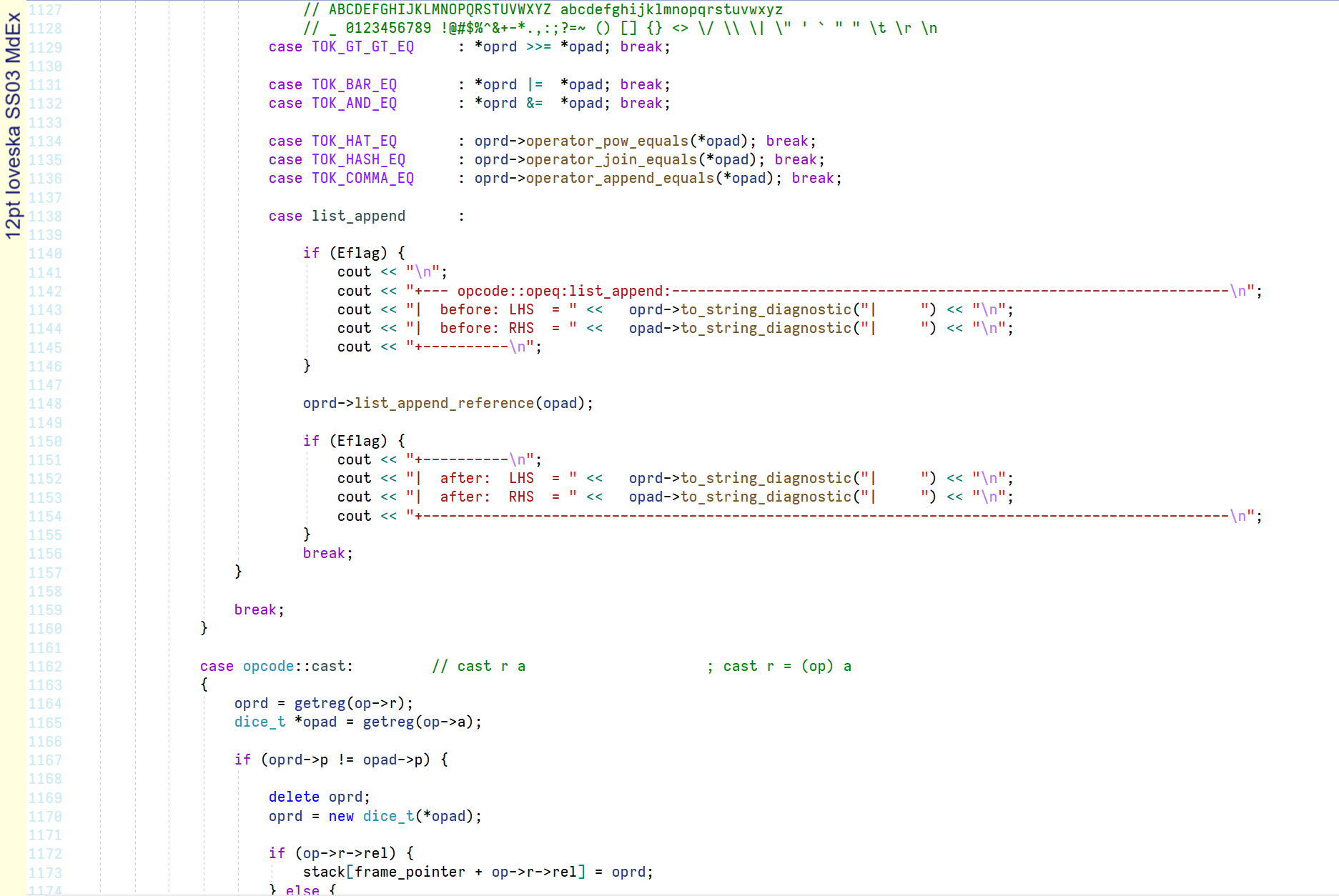
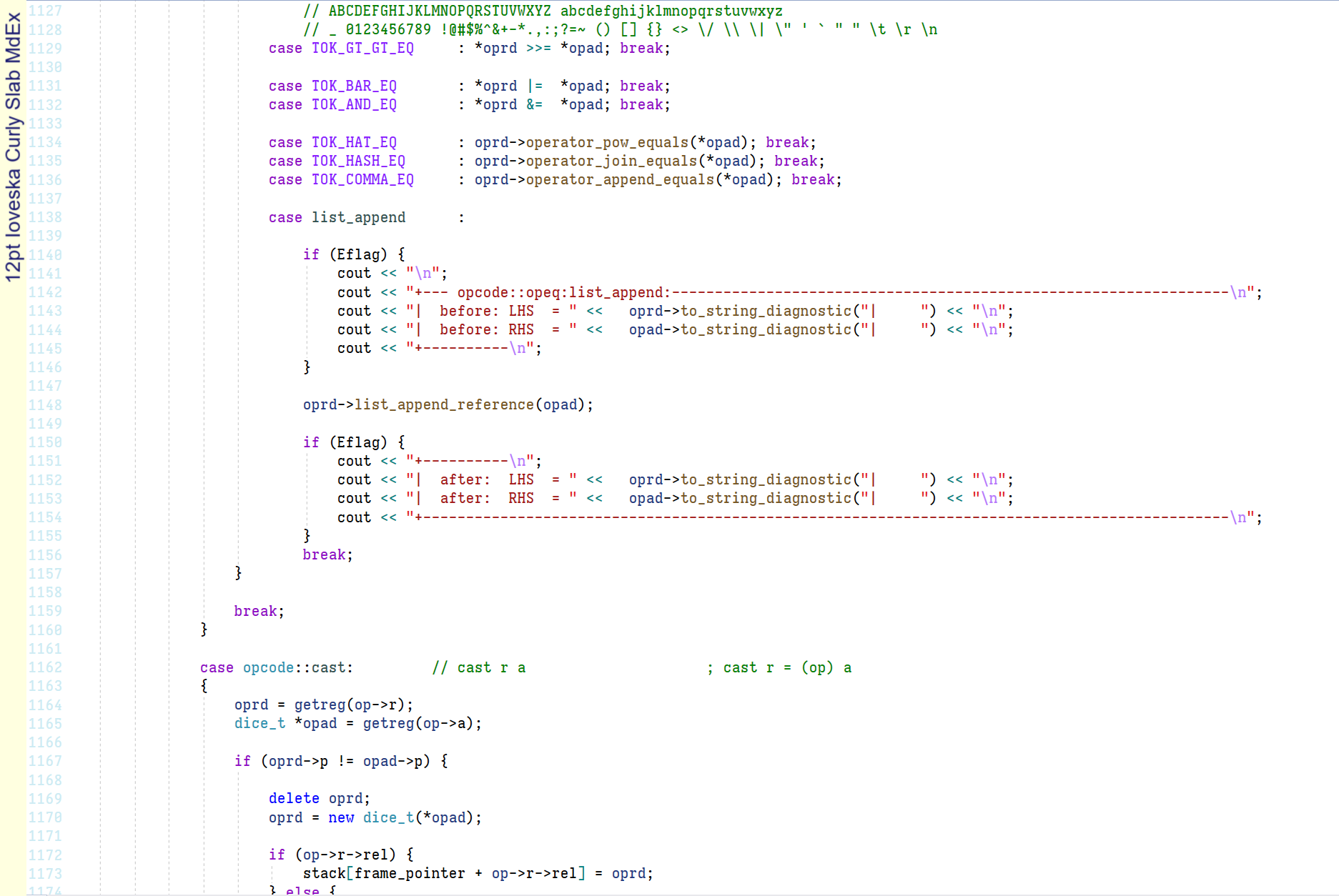
Iosevka SS03 MdEx
Iosevka Curly Slab MdEx
|
Iosevka (pronounced Jo'sev'kha) was created by Renzhi Li (aka Belleve Invis) in 2015.
Iosevka is a font built by code for writing code. It is programmer font porn.
So you prefer slashed zeroes to dotted zeros? You would prefer single story a's to
double story a's? Want your g's to have a loop instead of a tail?
Do you like a flat top on your 3?
Like your font weight a bit more than light, but a smidge less than medium?
Want a mid height six pointed asterisk with a vertical bar?
Iosevka comes in literally thousands of variations. And if you don't like any of the
prebuilt ones you can pick
and choose your own customisations and
build your own version with the Iosevka Customizer.
The two shown above SS03 (Consolas like), Md = Medium, Ex = Expanded spacing and
Curly Slab MdEx are couple of my favourites.
So this is the perfect font right? I mean you can literally choose your own
characters. Well it is still kinda ovalish for my taste, but not too bad.
But the downside to actually making your own font is the build process with a whopping
40+GB download. Ouch!
Still, Iosevka is showing the way for the future of programmer fonts.
Fab: 9.5
JetBrains Mono
JetBrains Mono was designed by Philipp Nurullin. It is free and open source.
Strong fundamentals.
There is a lot to like about Jetbrains Mono.
Some stylish characters in there too, with the fancy crossbar k's.
I never thought I could confuse a lower case L for an upper case Z, but will you look
at the size of the serif/tail combo on that thing?!
Really good: 9
Liberation Mono
Remember when fonts weren't antialiased? Well Liberation never got the memo.
It is still as pixelated as ever.
Look at those jaggies on the < and >. Underscore is too thin.
Tilde has barely any wiggle. Asterisk is tiny and high.
Move on: 5
Lucida Console
Font of not much choice back in the day. No good then. Still no good now.
Known for flowery petals on the asterisk and the unmissable huge pointy caret.
It also has extra pointy angle brackets, super tight leading and a high
choking crossbar on the lower case f.
However, It fails the similar O and zero test and is therefore relegated to
font bin of history.
Avoid: 3.5
Luxi Mono
Looks like Lucida's ugly cousin. I don't know why this font looks so bad. Maybe
it was never meant to be displayed at my preferred combination of point size and
zoom.
Or maybe it is just janky rubbish.
Either way it has flowery petals on the asterisk and a pointy caret, although not
quite as big as the Lucida caret. It has the same similar O and zero problem and
is therefore just unsuitable for programming. The upper case I, one and lowercase
L are not that distinct either.
Janky rubbish: 1
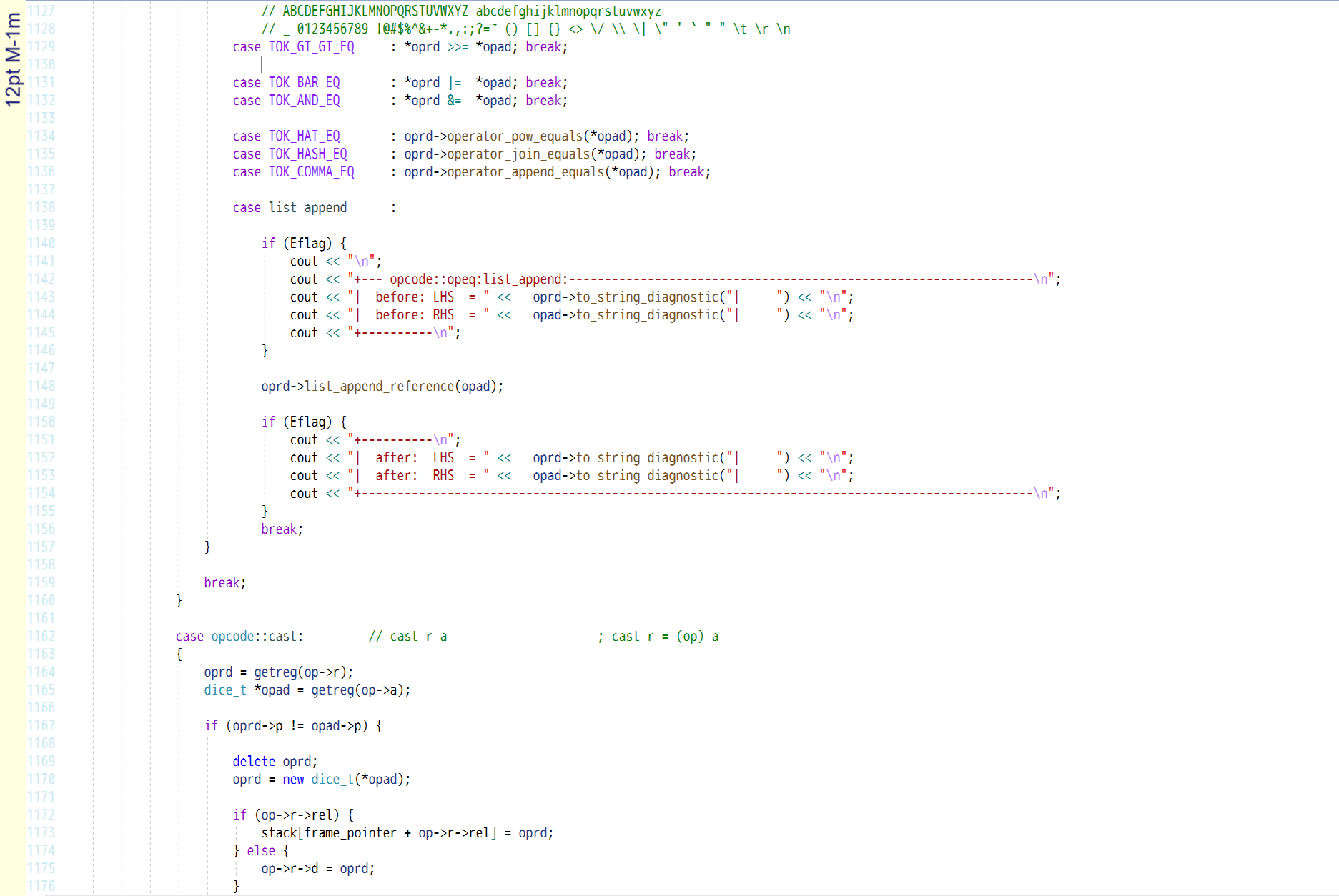
M-1m
Another janky font. Not quite as bad as Luxi Mono, but something bad is going on at
my preferred size and zoom.
Every character is munged in some way. Not even worth considering.
Awful: 1.5
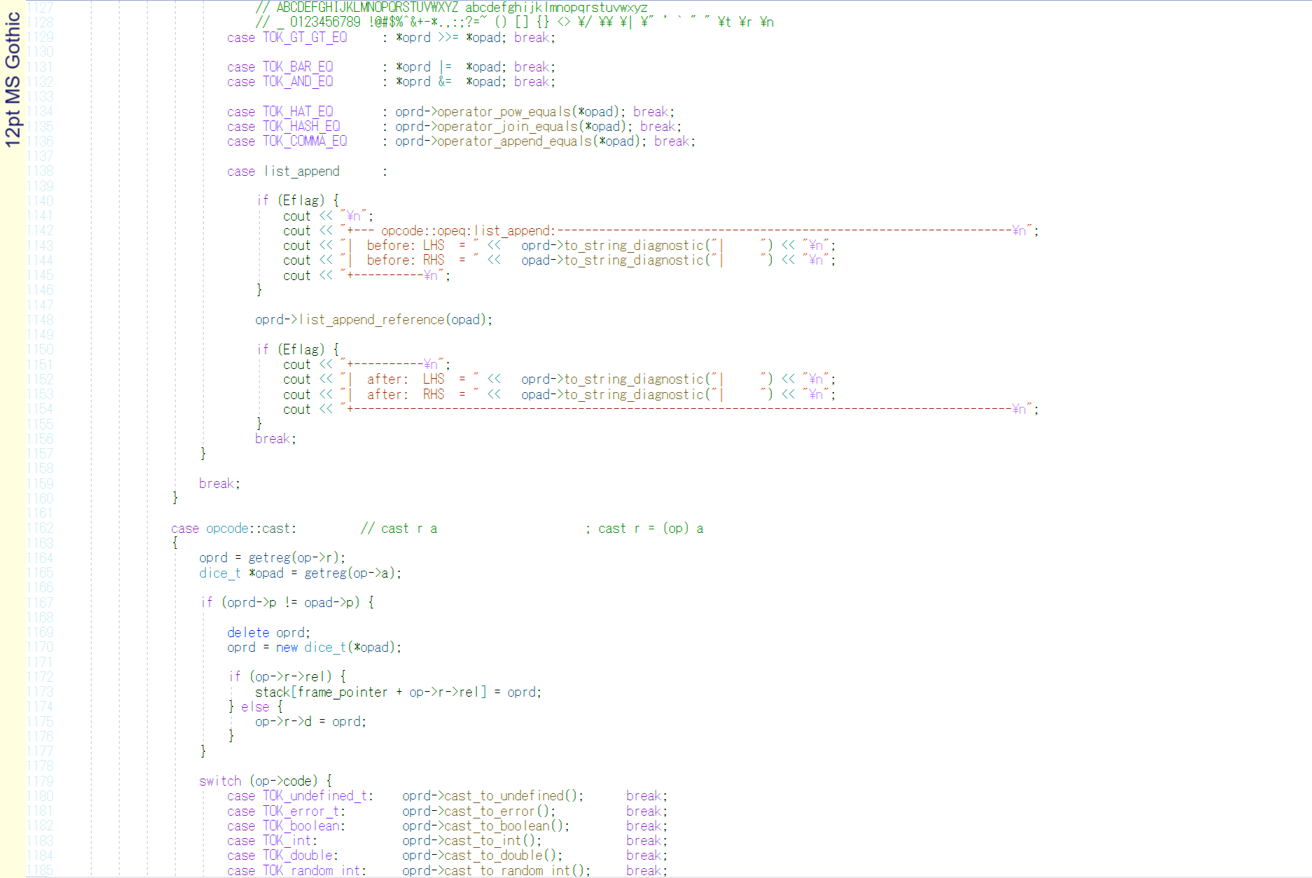
MS Gothic
Anemic and fragile looking font looks more at home on a dot matrix printout.
Very poor fundamentals with similar O and zero. Everything is so thin you could
possibly have confusion between capital I, one, lowercase L, vertical bar and maybe
even the ridiculously thin braces.
But the stand out fail here is that there is no backslash at all and instead we have
a yen symbol.
Megafail: 0.5
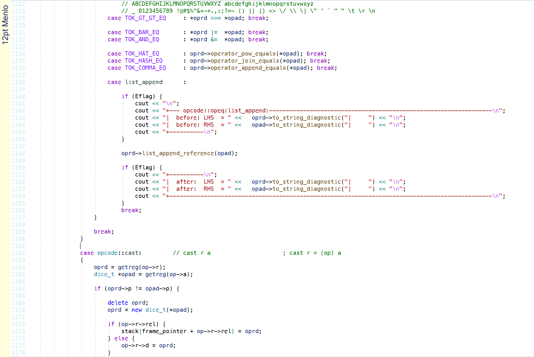
Menlo
A generation more evolution than Lucida, it is a little bit better.
It has pretty good fundamentals, but it is let down by a some bad characters.
The lowercase i is weirdly thin compared to the other characters. The lower
case L has a weak top serif. The backtick is also a bit weak.
The lower case e has a weak eye and a fallen lower stroke.
Too many bad characters: 4.5
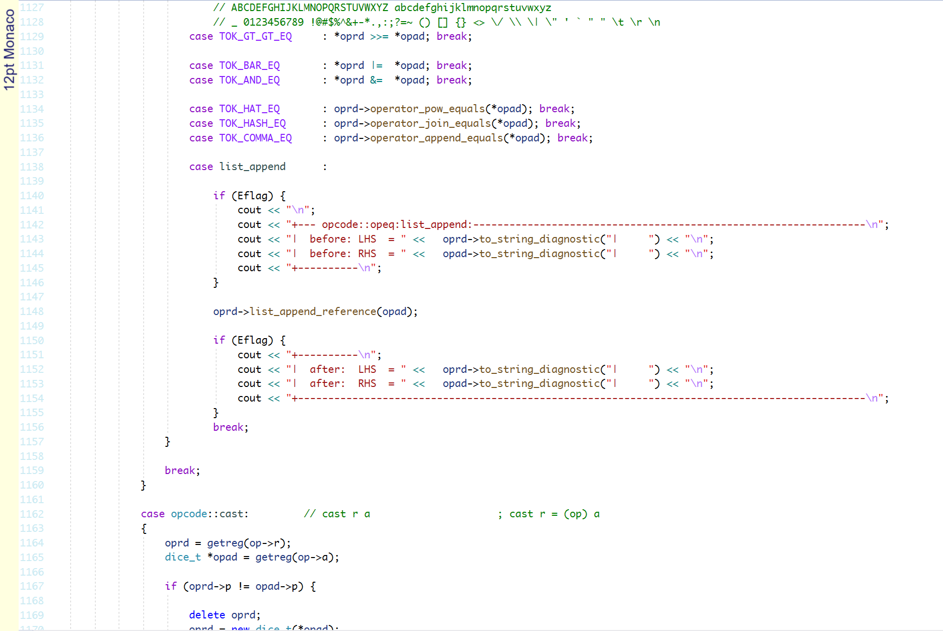
Monaco
Strong fundamentals and some stylistic curves make this a great choice.
Circular brackets are very deep and that is OK. There is a weird thin left
leg on the capital M. The backtick is weak.
Monaco is the only font in this list with a single story 'a' (apart from
Iosevka which has it as an option.)
Good: 7.5
Mono 07_55
Retro dot matrix font is actually not that bad. Maybe I am just used to reading it
from the good old days of pixels and dot matrix printouts.
The O and zero are not just similar, they are identical. Capital I, lower case L
and one are similar. All unacceptable today.
Rose coloured retro: 1.5
Monoid
Monoid has good fundamentals, but at this size and zoom it looks janky.
Most of the characters are poorly hinted. It is a shame really, it could have
been so much better.
Janky: 4.5
MonoLisa
MonoLisa has good fundamentals and some style.
The characters are clear with some delicate curves on the capital A and the Vv and
Ww.
I like the cat tail @ and the quizzical eyebrow lift on the question mark.
The brackets are perfect.
I would have liked a bigger caret and the backtick is a little weak.
I do not like lower case g. I don't like its ear or its open loop.
Great: 9
NSimSun
NSimSun is the font of all Chinese manuals. And it isn't too bad.
The characters are all pretty and serifed. I like that.
The asterisk has cute petals.
But it has poor fundamentals. The O and zero are similar.
The top serif on the lower case L is drooped a little making it very much like
a one.
The braces are a bit too thin. The tilde is sky high.
The caret is tiny and the backtick is barely there at all.
Potential: 2.5
NotCourierSans
NotCourierSans is like Courier because they are both bad.
Poor fundamentals. The capital O and zero are similar.
The capital I, lowercase L and one are all similar.
It is also a very flat and expanded looking font.
Unpleasant: 1.5
Noto Mono
Noto has a reputation for being a font people like to read. I don't know why.
Noto Mono has poor fundamentals with a similar capital O and zero.
The capital I, lowercase L and one are all similar, too.
The underscore is too thin and the hyphen is a little low for the -> pointer combo.
The backtick is a bit weak. The lower case i has the tiniest tittle.
Unsuitable: 3.5
Office Code Pro D
Office Code Pro Medium
Good fundamentals.
There is a lot to like here. Nice clear dots in the punctuation. Mid level asterisk.
Good clear letters.
Just a few small preferences. The backtick is too small.
The hyphen is a smidge high and the braces are a bit too curly.
And I am not a fan of the broken slash in percent.
Good: 8.5
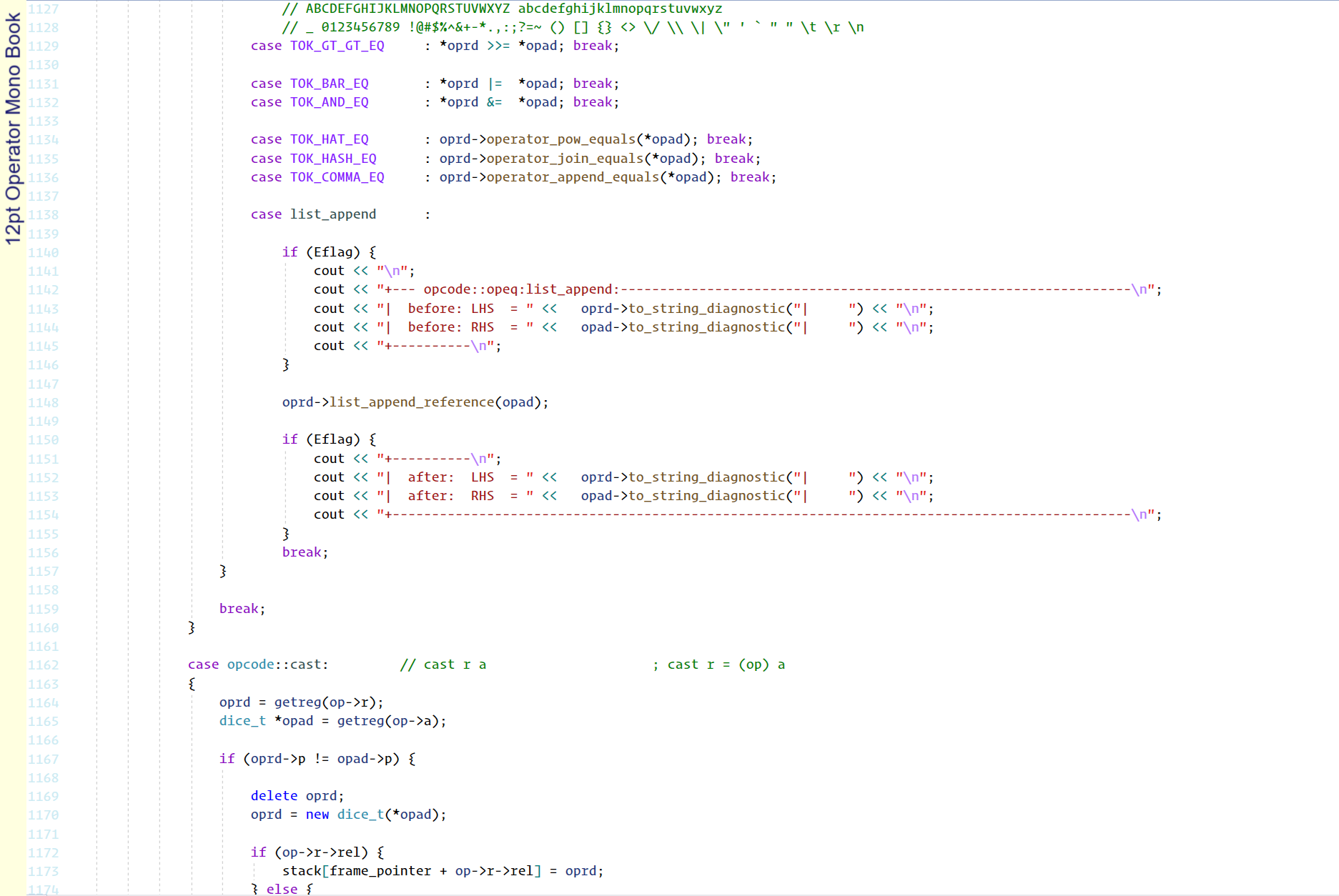
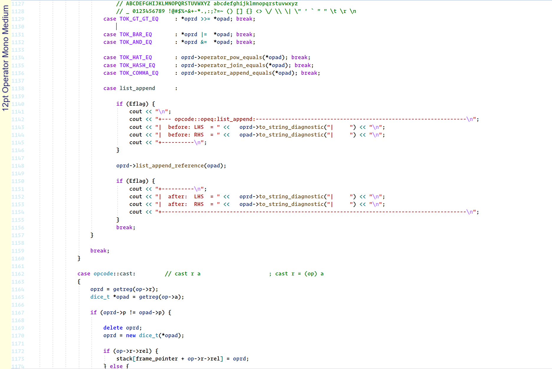
Operator Mono Book
Operator Mono Medium
Operator Mono has fair fundamentals with some stylistic elements.
At least it is not boring.
The lower case L and one are only a pixel away. The lower case r is a bit funky.
But I just can't get over those curly braces.
They look like a spider crawled in to my code. Get out!
Halloween font maybe? 7
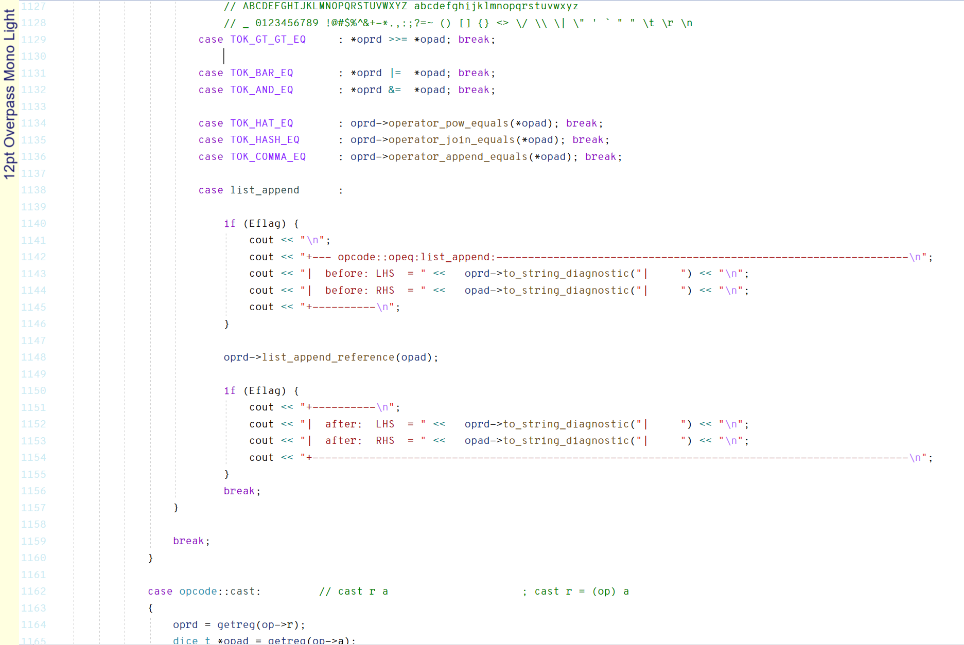
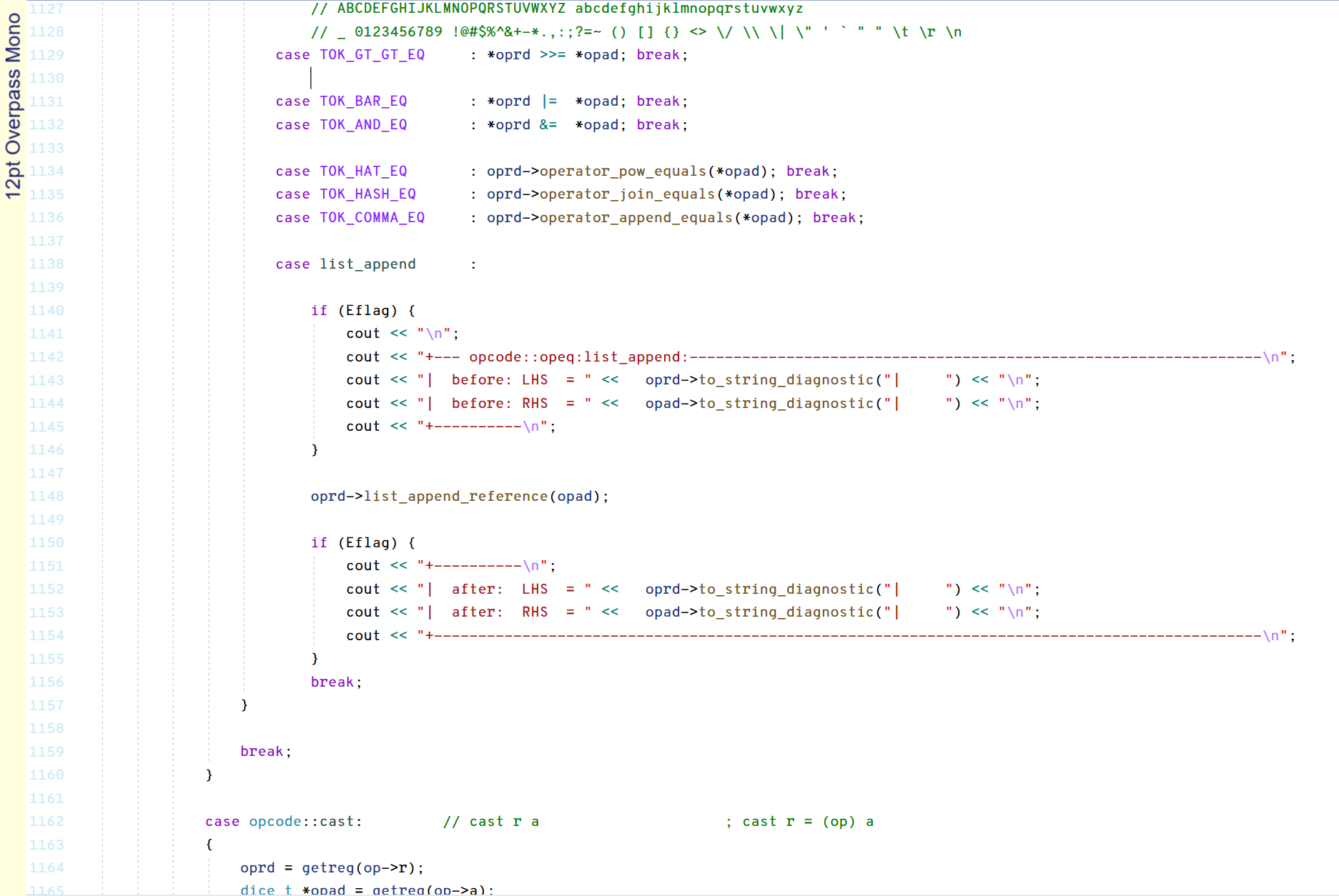
Overpass Mono Light
Overpass Mono
Fair fundamentals. Not the clearest of fonts for my liking.
The lower case L and one are not very different. The dots are small everywhere.
The tilde doesn't have much wiggle. The curly braces are not that curly.
The backtick is weak. The angle brackets are squished.
The lower case j has almost no hook. Descenders are pretty weak everywhere.
The lower case k looks like it is striking a modelling 101 hands on hip pose.
The equals sign in Overpass Mono has some sort of kludgy bottom bar.
Unappealing: 5.5
PT Mono
Good fundamentals. Clear letters. There is a lot to like here.
Some stylistic beaks on the upper case C, G, L S and T make it mildly interesting.
The a in the at symbol is uniquely on the baseline. The lowercase f has a foot.
The underscore, dots and backtick are a bit weak.
The tilde doesn't have much wiggle.
Cute, but not great: 6.5
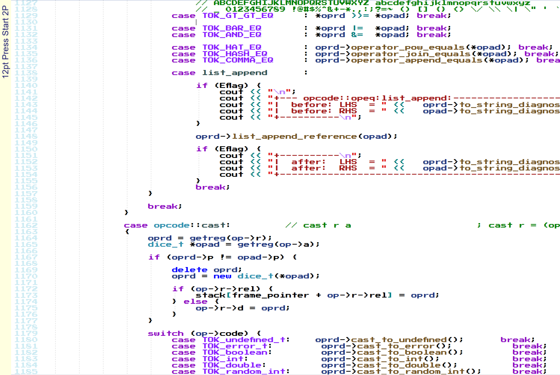
Press Start 2P
Press Start 2P is a bitmap font based on the font design from 1980s Namco arcade games.
Press Start 2P has weak fundamentals.
The O and zero are similar as are the lower case L and one.
The pixelation is very distracting and has a cluttered appearance.
I keep wanting to type my high score arcade handle into it.
This one is not going make the high score table: 2.5
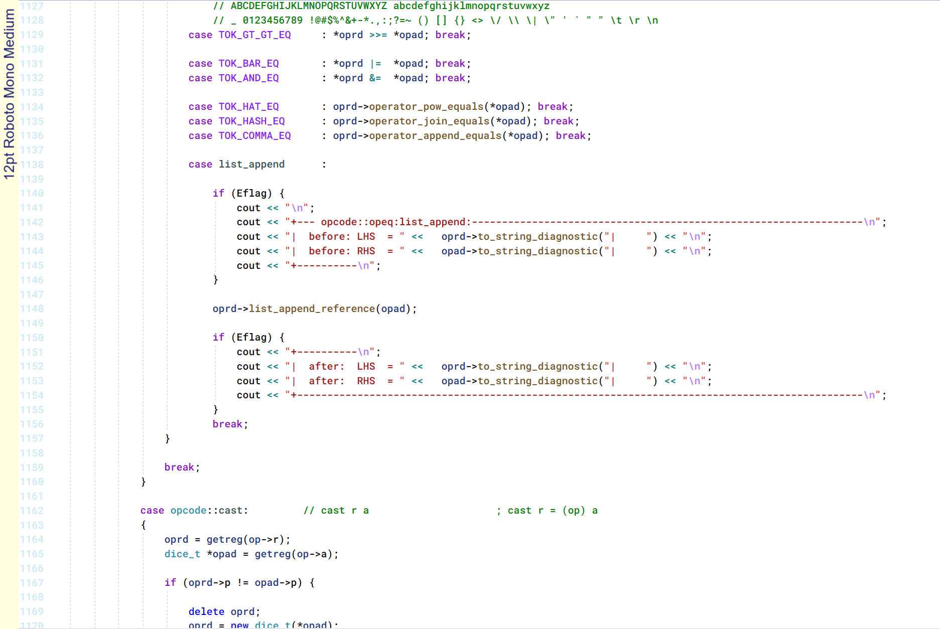
Roboto Mono
Roboto Mono Medium
Roboto Mono was designed by Christian Robertson in 2015 for Google as part of the
Roboto family for the mobile OS Android.
Strong fundamentals. The characters are clear and great.
Very little wrong with it. Maybe the angle brackets could be a bit bigger.
The single quote and backtick are a bit weak. The braces could have more style.
The dollar sign could have more stroke.
Great choice: 9
Sax Mono
Poor fundamentals.
The capital O and zero are similar.
The lower case L is one pixel taller than the one, but otherwise identical.
The dots are more like tiny dashes. The braces are too thin.
The backtick is weak. And the exclamation mark is just wrong.
No good: 2
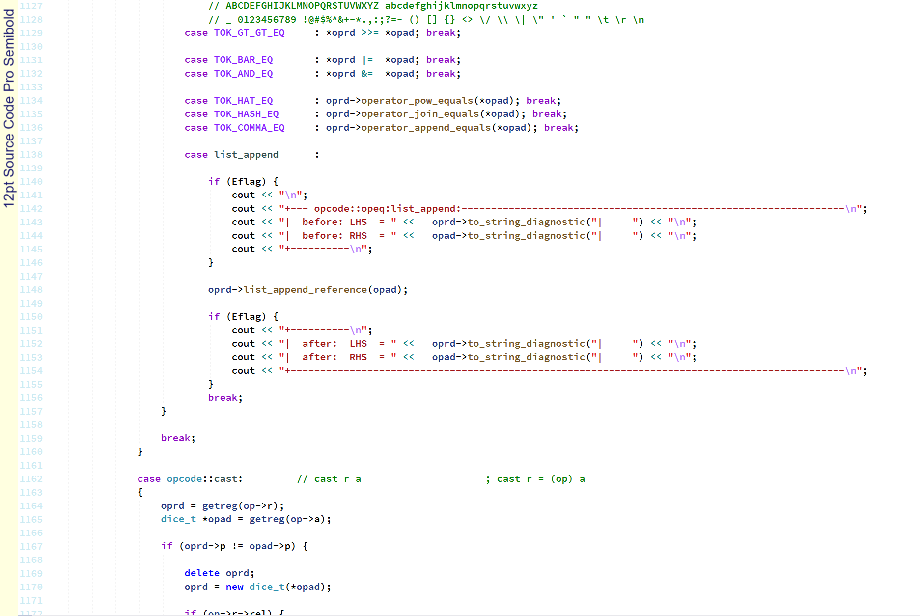
Source Code Pro Light
Source Code Pro
Source Code Pro Medium
Source Code Pro Semibold
Source Code Pro was created by Paul D. Hunt for Adobe Systems.
Technically near perfect, it is a great choice for programming.
Clear and distinct characters are functional and beautiful.
Almost everything that is wrong with monospaced fonts is covered here.
Capital I, lower case L and one are distinct. I love the crank handle lower case L.
Dots are all strong and clear. The backtick is perfect. The brackets are all great.
Not much fault here. Just a few preferences.
I would like a slashed zero and a full crossbar on the percent.
Normally I like a full bar on my dollar sign, but this one is all right the way it is.
Technical perfection: 9.5
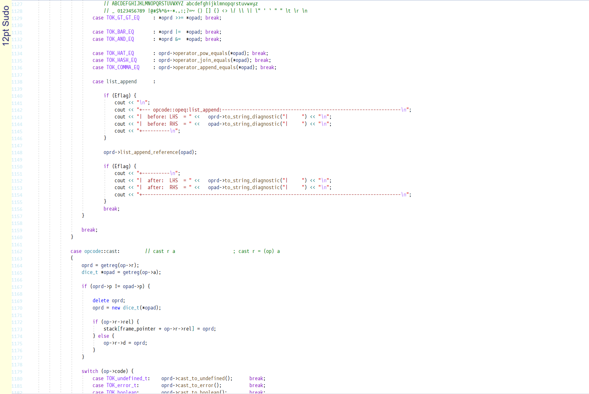
Sudo
A free font for coders by Jens Kutílek.
Sudo has strong fundamentals and a lot of style.
It is a very condensed font. Some people like that, but I would prefer more room
to breathe.
The upper case characters have a lowered crossbar, all nicely aligned.
Some nice curve touches here and there make the font stylish and interesting.
Mid asterisk, nice hyphen and good brackets.
I would prefer expanded, but really nice otherwise: 9
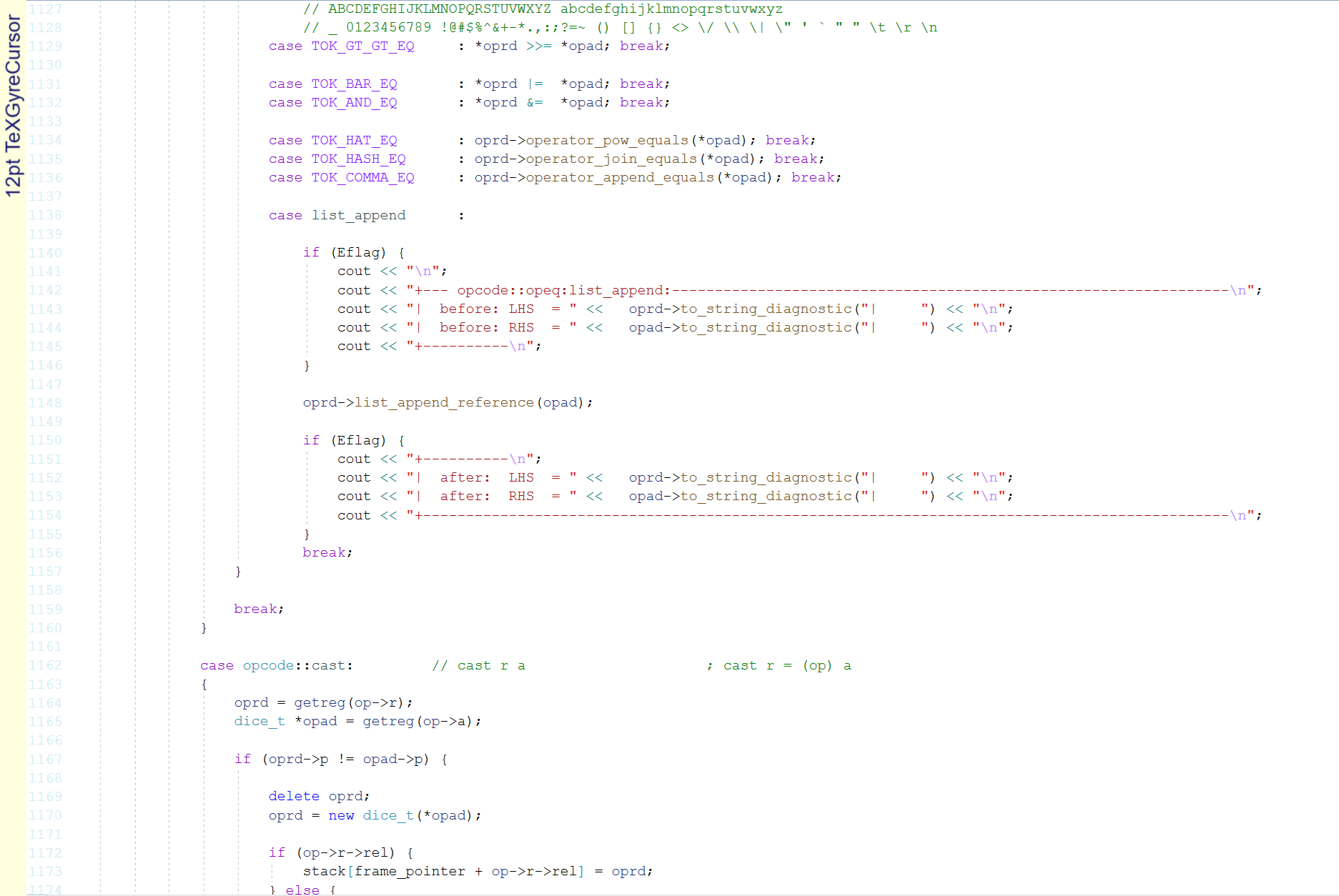
TeXGyreCursor
See
Courier New: It's a 2
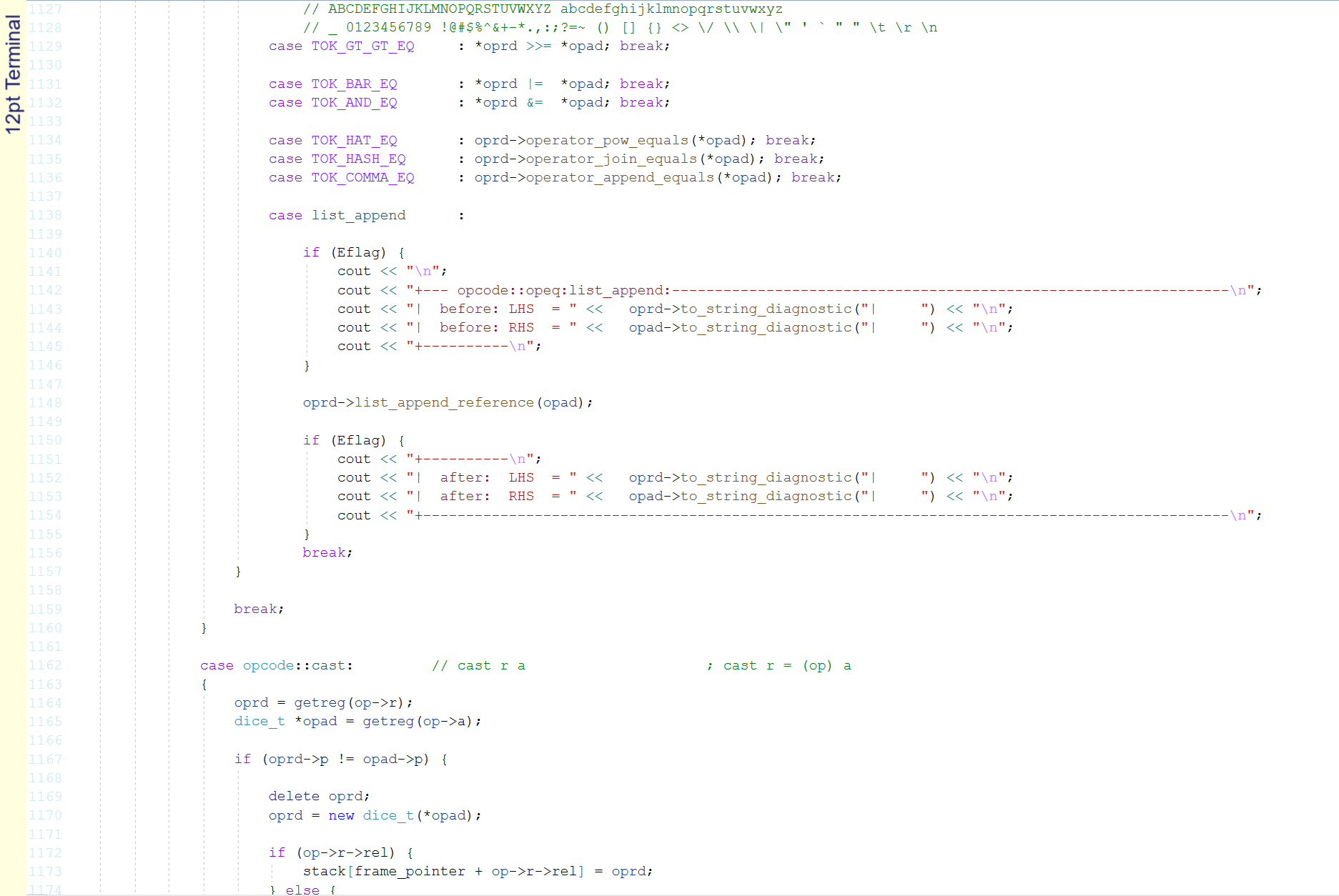
Terminal
See
Courier New: It's a 2
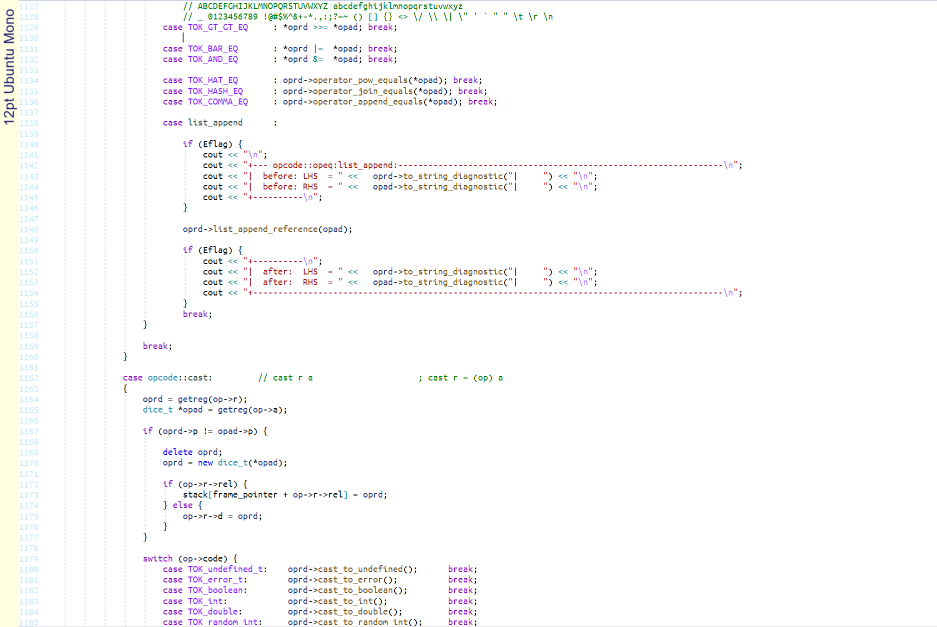
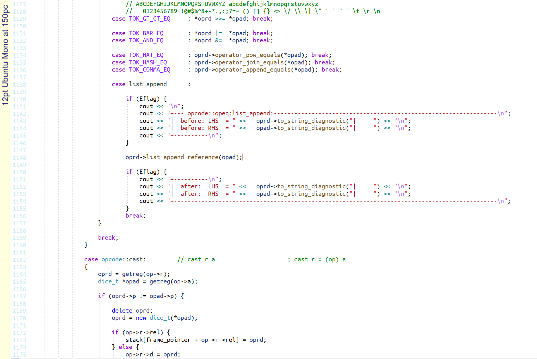
Ubuntu Mono
Ubuntu Mono at 150%
Ubuntu Mono was designed by Vincent Connare at Dalton Maag for Linux Ubuntu in 2010.
Ubuntu Mono is the font of choice for all code presentation in conferences.
It is a great choice for programming.
Note that the font is quite small at 12pt, so I have shown it here at 150% too,
to match the size of the other fonts on the page (which are all at 125%).
Ubuntu Mono has good fundamentals and some style too.
There is very little to complain about, just some preferences.
The angle brackets are a bit squished. The hyphen is a little short.
The backtick is a bit weak and the asterisk is not mid level.
But it is a great choice: 9
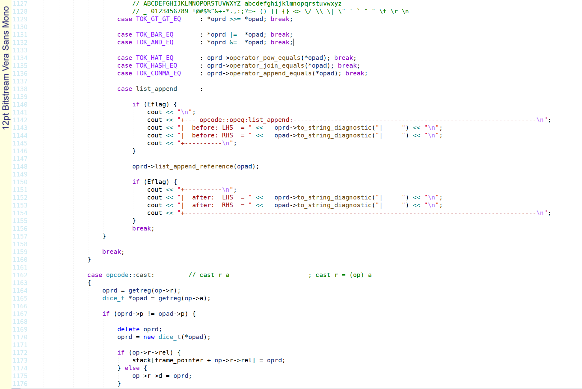
Vera Sans Mono
Vera Sans Mono was designed by Jim Lyles from Bitstream Inc in 2002.
Really nice font. Very little to not like about it.
Maybe would have liked a slashed 0. Hyphen is a little short.
Angle brackets are a little pointy.
Very good. It's a 9.